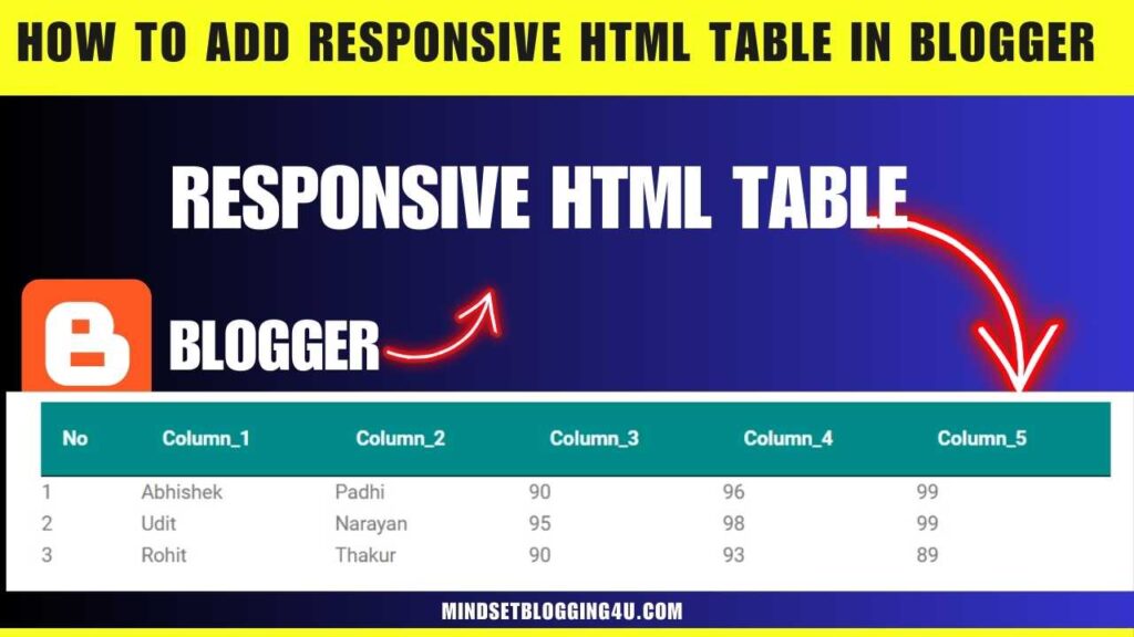
Friends, if you are searching and till now you have not found How to add responsive HTML table in Blogger in an absolutely easy way then you have come to the right place, now you do not need to go anywhere else because in this post you have been told in such an easy way. which any child can do easily
So let me tell you that all the posts on our website are very easy so that anyone can easily add any feature in any type of blogger and also many features are provided for bloggers in our website. have gone
If you want, you can also see and today in which post we will know how to use Responsive HTML table in Blogger. So before moving ahead, we should also know what is Responsive HTML table in Blogger.
What is responsive HTML table in Blogger?
Friends, we call it Responsive HTML table in Blogger in which the post we write for our user, if he understands it well, then we can understand it by creating a table, but it should be a responsive HTML table, we can add text to it and make our User can create invisible content for the user, that is what we call Responsive HTML table in Blogger.
How to add responsive HTML table in Blogger?
So friends, now I will tell you how you can add responsive HTML table to your blogger website in a very easy way which if no one told you then just follow these below steps and after that you will face any problem. So please tell us by commenting, you will definitely get a reply.
Step1:- You go to your blogger’s dashboard.
Step2:-After that click on New Post
Step3:-So now you click on the pencil button on the left side and click on HTML viewer.
Step4:-Now you have to copy this responsive table code given below.
<div class="table">
<table style="white-space: nowrap;">
<thead>
<tr>
<th>No</th>
<th>Column_1</th>
<th>Column_2</th>
<th>Column_3</th>
<th>Column_4</th>
<th>Column_5</th>
</tr>
</thead>
<tbody>
<tr>
<td>1</td>
<td>Abhishek</td>
<td>Padhi</td>
<td>90</td>
<td>96</td>
<td>99</td>
</tr>

<tr>
<td>2</td>
<td>Udit</td>
<td>Narayan</td>
<td>95</td>
<td>98</td>
<td>99</td>
</tr>

<tr>
<td>3</td>
<td>Rohit</td>
<td>Thakur</td>
<td>90</td>
<td>93</td>
<td>89</td>
</tr>

</tbody>
</table>
</div>


<style>
.table {
display: block;
overflow-y: hidden;
overflow-x: auto;
scroll-behavior: smooth;
}

.table thead {
display: table-header-group;
vertical-align: middle;
border-color: inherit;
color: white;
background: darkcyan;
}

tr {
display: table-row;
vertical-align: inherit;
border-color: inherit;
}

table th {
padding: 16px;
text-align: inherit;
border-bottom: 1px solid black;
color:white!important;
}

tbody {
display: table-row-group;
vertical-align: middle;
border-color: inherit;
}

table:not(.tr-caption-container) {
min-width: 100%;
border-radius: 3px;
}
</style>
Step 5:- Now after copying the code, paste it wherever you want to add it in your blogger post.
step 6:- And after that, your last step is to publish.
If you want next level advanced Resposnive Table htlm code then you can use this below already i provided code. and follow same upper steps.
<div class="table-container">
<h2 class="table-heading">Sample HTML Table 2</h2>

<table style="white-space: nowrap;">
<thead>
<tr>
<th>First Name</th>
<th>Last Name</th>
<th>Percentage</th>
</tr>
</thead>

<tbody>
<tr>
<td data-heading="First Name">Abhishek</td>
<td data-heading="Last Name">padhi</td>
<td data-heading="Percentage">90</td>
</tr>

<tr>
<td data-heading="First Name">Happy</td>
<td data-heading="Last Name">singh</td>
<td data-heading="Percentage">85</td>
</tr>

<tr>
<td data-heading="First Name">Virat</td>
<td data-heading="Last Name">kohli</td>
<td data-heading="Percentage">80</td>
</tr>
</tbody>
</table>
</div>

<style>
.table-container {
font-family: system-ui;
}

.table-container table {
width: 100%;
background: #fff;
color: #222;
box-shadow: 0 4px 15px -8px rgba(0, 0, 0, 0.4);
border-collapse: collapse;
}

.table-container h2.table-heading {
text-align: center;
text-transform: uppercase;
font-size: 24px;
margin-bottom: 32px;
border-bottom: 1px solid #eee;
padding-bottom: 8px;
}

.table-container table {
width: 100%;
background: #fff;
color: #222;
padding: 24px;
box-shadow: 0 4px 15px -8px rgba(0, 0, 0, 0.4);
border-collapse: collapse;
}

.table-container table thead tr {
background: #222;
color: #fff;
}

.table-container table td,
.table-container table th {
padding: 16px 32px;
text-align: center;
}

.table-container table tr {
border-bottom: 1px solid #eee;
}

table thead th {
color: white!important;
}
</style>
- How to Remove ?m=1 from URL in Blogger
- How To Add Code Box In Blogger Post
- How To Remove Date From Blogger Post URL [[2023]]
- How To Add Autoplay YouTube Videos on Blogger Article
- How To Add Contact Form In Blogger {{Stylish}}
- How To Embed PDF in Blogger Post (2023)
- How to Add AUDIO File in Blogger Posts?
- How To Insert Hyperlink In Blog Comment Blog {4 steps
- How to Enable Dark Mode in Blogger Blog (working)
- How to Create an HTML Sitemap Page for Blogger Blog
- How To Add Reading Progress Bar In Blogger
- How to Add a Floating YouTube Subscribe Button on Blogger
Conclusion
So friends, by now you must have seen the Responsive HTML table in Blogger, then you have to comment and tell us how you liked today’s post. If you are facing any problem, then you can also tell us by commenting, your problem will also be solved.
And as I have told you, you will definitely get to see the video below each post, which can help you more. If anyone does not understand from the content, then he can also understand from the YouTube video which I have given below each post. Provided for every post
So now you just have to share this post as much as possible and to see similar content, you can name our website mindsetblogging4u.

